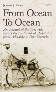
 Title: From Ocean to Ocean
Author: Jerome J. Murif
Designer: Sylvain Eliade
Genre: Travel, memoir
Graphics: In 1897 Jerome J. Murif bicycled across Australia, from south to north, from Adelaide to Port Darwin, in 74 days, without sponsorship or support and without benefit of paved roads or even many dirt roads. This is his account of his trip. It’s just, therefore, that the cover include a photo of him and his bicycle.
Inasmuch as Murif disappeared from history the year after his ride, it’s not surprising that there must be few photos of him. He was a loner who wanted to do something big, did it, and then was forgotten. Fortunately the editor, who also is the cover designer, found a photo that, nearly a century-and-a-quarter later, catches the eye because to us it seems a period piece. Murif stands stiffly by his steed, looking not at the camera but seemingly into the distance. His bicycle, a little surprisingly, looks like many hardtails we see today.
Murif’s right arm is cut off by the left edge of the cover, and the bicycle’s front tire nearly touches the right edge. Perhaps the designer was trying to make the image as tall as possible and so sacrificed airiness, but the photo gives the impression of having been carelessly cropped. Had the photo been reduced slightly, with the complete arm visible and the tire further from the edge, that impression would have been obviated.
The photo takes up something less than half the cover and is cut off diagonally. Above it is a line drawing, not a direct taking from the photo (the rider’s hand is positioned differently, for example) but clearly a representation of a similar scene. The drawing occupies space but otherwise adds little; it might have been better had it been a depiction of Murif riding. The main problem is that the drawing draws the eye away from the photo and away from the text.
The original photo must have been in black and white, given the era, but on the cover it and everything else is in sepia tones. This gives an old-timey feel but also makes for a bland cover. It might have been interesting to try a few color highlights on the bicycle, thereby drawing additional attention to it, or perhaps it would have been enough to add color to some of the text.
I am unable to discern what the opening in the wall, above the bicycle, might be. I would have airbrushed it out. The hole does nothing but distract. At thumbnail size it looks like a rectangular splotch, and at the cover’s maximum size online it still is a puzzle. Perhaps the text explains what it is, but a viewer shouldn’t have to read a book to understand elements of the cover.
Typography: Everything on the cover is pushed to the left: the rider, the title, the subtitle, and author name. The only exception is the date of original publication, which ought not to be on the cover at all. The text should be centered, to contrast with the leftward emphasis of the photo.
At least the title should be in a color aside from its present brown. Deep red would do. The title is in a font that suggests handwriting, and that’s fine, but the subtitle is in italics, which is not fine. It should be in roman, and it could stand shortening.
Australia is known to be a continent, so there is little purpose in labeling it as such, and the opening words of the subtitle, “An account of,” are unnecessary. The subtitle could be reduced to this: “The First Ride Across Australia, from Adelaide to Port Darwin.”
Although the wordcount would be reduced this way, the text size should be increased; there will be room for that, even if the subtitle is refashioned into two lines rather than three.
Notice my addition of a comma. With the comma, the subtitle implies that this was the first ride across any part of Australia and that it happened to be from Adelaide to Port Darwin. Without the comma, the subtitle implies that this was the first ride from Adelaide to Port Darwin but that there may have been earlier rides across Australia between two other cities.
In the title, the preposition “To” should be changed to lowercase. Small words, such as prepositions and articles, should be lowercased unless they begin a title or sentence.
The author name is far too small. One almost has to hunt for it. It should be in all caps (not large and small caps), enlarged to at least twice its present height. It might look good if the letters were widely kerned, a common attribute given to author names. As mentioned above, the publication date, 1897, should be deleted.
Overall: This cover’s biggest problem is the gratuitous line drawing in the background. It provides no information not already provided by the photo of the bicycle, and it obscures the text.
The text itself needs reworking; it needs concision. This is as true for the cover of a book as for its interior text. An author always should be asking himself whether something can be stricken out. Usually, less is more.
