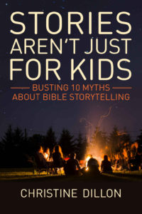
 Title: Stories Aren’t Just for Kids
Author: Christine Dillon
Designer: Lankshear Design
Genre: Religion
Graphics: The author’s premise is that adults, as well as children, can learn the elements of the Christian faith through biblical storytelling. How to convey storytelling graphically? Where does storytelling occur in everyday life outside a specifically religious venue? Around a campfire. Thus the image.
It’s a natural, but it has drawbacks: it’s small proportionate to the whole, and it’s hard to see details.
The image takes up too little of the cover. The part of the cover that is supposed to convey the genre or what the book is about is minimized unnecessarily. That’s the first problem: the smallness of the round-the-campfire portion of the image.
The other problem is that one almost has to squint to figure out what is being portrayed. Even at the largest available size (when the cover is clicked on at the Amazon sales page for the book), it’s still hard to tell what is being portrayed.
The segment of the image to the right of the fire’s glow looks as though that portion of the photo had been taken while the camera was moving; it’s all a blur.
The silhouette directly blocking the fire can be interpreted more than one way. Is it the back side of a person under a blanket, or is it the back side of a large dog?
The people off to the left seem to be talking among themselves and not interacting with the others.
I would look for a more intimate campfire photo, one with fewer people, a photo where the fire has died down to embers so the fire’s glow doesn’t overpower the scene. I would prefer a close-up shot, perhaps with everyone in shadow. The intimacy of such a photo would add to the sense of storytelling. The photo used on the cover seems to be not of people listening to a single storyteller but just chatting with one another in several small groups.
Typography: The off-white color of the title and author name works well. It suggests evening, and the text is easily visible against the solid background.
To give an alternate photo more room and thus more prominence, the author name could be lowered a little (about half the height of the characters), and the title could be compressed vertically by about one-fourth. That would open up space for a new image that would be where the eye first goes.
The subtitle looks fine with the two rules extending from the first line. They keep the text in the top half of the cover in a rectangle. The color of the subtitle is a little subdued; a lighter shade would help. Other than that, there are no problems with the text.
Overall: This cover would earn an A if the photo were more intimate and more suggestive of the theme. That should be an easy fix. Until the fix is made, and because of the importance of the photo, I’d give the cover, as it stands, no more than a B-.
