Title:  Rome’s Female Saints
Author: Nicol Nixon Augusté
Designer: André Augusté
Genre: Religion
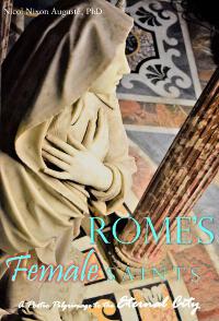
Graphics: The cover seems to have been designed by the author’s husband. The photo he took is quite good, with the focal point being the saint’s crossed arms, which give a sense of humility and supplication, just what you’d expect from a saint.
The secondary focal point is the pillar, which is darker in tone than the statue and thus is a nice contrast. Perhaps it would have been better to restrict the camera’s focus to the statue, allowing the inlaid floor to become blurred. That would have made the saint’s face stand out better, but otherwise the photo is fine, though it was cropped too close to the head.
Typography: The typography is far less than fine. Let’s start at the top.
The author’s name is nearly invisible at thumbnail size. It’s hard to read even at larger sizes. It ought to be at least three times as tall and wide. Her three-part name (which should be in all caps) has a lot of characters, so a condensed font would be in order, one that has thick verticals that stand out against the visually complex background. There is no need for “Ph.D.” This is a book chiefly of poetry; the author’s academic credentials aren’t relevant.
The revised author name shouldn’t go at the top; there would be no way for it not to overlap the saint’s head. It and all the text should go in the lower third of the cover.
The subtitle is even less legible than the author name, even though it’s larger. Actually, it’s larger in two different sizes, with “Eternal City” being larger than the first part. The script font would be hard to read regardless, but here, in white against a background that has light elements, it’s painful.
The main title not only is in two fonts but is in three sizes, and “Female” has a reddish drop shadow. The three words of the title are in a pale blue-green. Perhaps the designer thought that would say “feminine,” but it’s enough that the middle word of the title is “Female.” All three words should have been in one font. Depending on the color chosen for the author name and subtitle, the title could be in black or a strong color picked up from the image, though black seems the best bet.
Overall: Using oneself or one’s spouse to do the artwork saves time and money, but usually it is an unwise savings. To echo a biblical question, what does it profit an author if she saves a few dollar but loses sales? No book will sell well if its title is hard to read.
