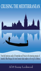
 Title: Cruising the Mediterranean
Authors: Al & Sunny Lockwood
Designer: Wallman Design
Genre: Travel, memoir
Graphics: In the opening pages one of the co-authors notes her fascination with Venice, which becomes the focus of a journey she and her husband make. It is fitting, then, that the cover features Venice. The silhouette of the city’s skyline is not architecturally accurate, but it’s enough, when coupled with the water, to suggest La Serenissima.
If this view of Venice is understood to be from the island of San Giorgio Maggiore, there is a mild falsification: gondolas restrict themselves to the narrow canals of Venice; they don’t venture into the open water as do the vaporettos. But little matter. The prospective reader gets the message.
The only colors on this cover are shades of blue, black, and white. The skyline is in a blue so dark that it almost is black. The gondola and gondolier are in solid black. It would have been good to have a more marked contrast. When graphic elements are so close in color the variance may be taken as an oversight by the designer.
I would have made the skyline lighter and its reflection lighter still (and somewhat rippled), and I would have added hints of other colors, such as a few spots of yellow to imply illuminated windows in several of the buildings.
The tagline—it isn’t phrased as a subtitle—is in a light blue area near the bottom of the cover. There seems no good reason to segregate this area, other than to provide a light background for the text. It would have been better to extend the water.
The author names are in a dark-blue band at the bottom. As with the area immediately above it, the band serves no purpose except to provide a background, in this case dark, for the text. The cover would look more uniform is this band also were removed and replaced with an extension of the water.
Typography: The title itself is slightly misleading, since four of the eighteen chapters (not counting those about trip preparation) are concerned with touring Amsterdam, which, of course, is not in the Mediterranean. Had I been asked about titling, I might have suggested the simpler Cruising or Cruising North and South—something like that.
As far as the title’s text goes, the serif font is a little hard to read when viewed at thumbnail size, and the words stretch too far across the cover. I would place the title in three lines and change the font to one that subtly suggests motion (as in cruising). There is so much water in the lower part of the cover that the skyline can be lowered considerably, giving plenty of space for much-larger title words.
I would skip all caps and gone with upper- and lowercase, to give more legibility and variety to the two long words, and I would use a color other than white for the title—perhaps the same yellow as used in the windows.
At the bottom, as a contrast, I would place the author names in all caps (small caps, really) and perhaps kern them widely, to give that text airiness. I would put the names in bright white.
What to do about the long tagline?
It reads like a sales blurb (“this travel memoir takes readers on the trip of a lifetime”), so I would relegate it to the back cover of the paperback version and maybe to the interior of the ebook version, or I might leave it out of the ebook version entirely and use it just for the book description at Amazon.
In place of the long tagline it might be sufficient to highlight, in a teasing fashion, the locales, thus having something like this: “Amsterdam—Venice—Athens—Santorini—Ephesus—Istanbul.” Letting buyers know where the authors traveled is enough for the cover.
Overall: This cover needs fixes, but they are easy to implement. The mistakes are ones common to indie books, and by correcting them this book can appear to be more than an indie project.
