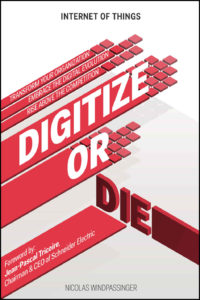
 Title: Digitize or Die
Author: Nicolas Windpassinger
Designer: Maxime Zoffoli
Genre: Business
Graphics: This book is about the Internet of Things and aims to help businesses deal with the “digital evolution [sic]” before they get left behind by the competition. Is that what the graphics on this cover suggest? Not that I can see.
There is a slight sense of motion in the five upper red bars as they transform into separated squares, but what are we to understand that to mean? If the title were omitted, would the graphic elements in any way convey the genre of the book, other than that it is a work of non-fiction? To me the red elements seem little more than clutter, conveying almost nothing.
One might expect that the graphics would play off the first word of the title, in some way invoking numbers or a change from doing things in an analogue way to doing them in a digital way, but there is no hint of that. I wonder if the cover would be more effective if these graphics were removed entirely.
Typography: If the failure to digitize results in death, whose death will it be—that of a business or that of the reader? If read the second way, the title is off-putting, if not actually threatening. In part this is a consequence of the lack of a visual connection between the title and the graphics.
Logically, which is the more important word of the title, “Digitize” or “Die”? Certainly the first, but the word that stands out, because it stands up, is “Die.” It is the only three-dimensional text on the cover, and its face is in the darkest color, so it attracts the eye, but in the wrong way. The title is a little hard to read since the final word is set at an angle from the others. It’s almost as if “Digitize or” doesn’t go with “Die.”
As for the author name, it takes a little hunting to find it, and at thumbnail size it is illegible, in part because its thin letters, which seem to be not quite black, are placed over a gray bar.
The tagline that identifies the genre, “Internet of Things,” stands out more because its letters are bold and black and set against white. (I call this a tagline, though at the Amazon sales page for the book it seems to be the actual title, given as Internet of Things: Digitize or Die. I presume that’s a mistake in layout.)
What might be taken as the subtitle consists of three hard-to-read lines (they aren’t readable until one maximizes the size of the cover at Amazon): “Transform your organization. Embrace the digital evolution. Rise above the competition.” What good do these words do if they can’t be read?
Lastly, there is the note about the foreword, which begins with unnecessary punctuation: the colon after “by” should be eliminated. Is the writer of the foreword someone widely known to the prospective audience? Maybe, since he heads a foreign multinational, but then maybe not, since the target audience seems to be American businessmen.
Overall: This cover fails at all levels, sad to say. The graphics fail to suggest the genre and hardly look professional. Most of the text is illegible, and the title arrangement puts the emphasis on the wrong word.
