 Title: The Power of Creativity
Author: Bryan Collins
Designer: Bryan Collins
Genre: Self-help
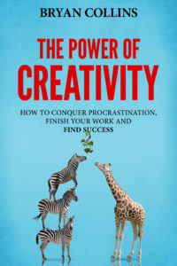
Graphics: The stock image isn’t bad, although it might suggest ingenuity rather than creativity. The animals are trying to reach the ivy, but why does the ivy dangle from the word “success”? Is this a not-so-subtle hint by the author? If so, it doesn’t quite work. It would have been better to leave plenty of space between the ivy and the words.
Typography: Non-fiction books usually feature fairly plain fonts, whereas many fiction genres feature fonts that somehow suggest their genres, such as curlicued fonts for romance novels. We see two fonts, a sans serif for the title and a serif for the author name and subtitle. Given how many words there are in the subtitle, I would have switched the fonts, using the serif for the title and the sans serif for the remaining words.
Placement of the text is the chief problem here. The author name is too small and is too close to the top of the cover. If the book were to be printed as a paperback, trimming might result in the author name ending up right against the top, and that would look awful.
A bigger problem is the size and placement of the subtitle. The first phrase, “how to conquer procrastination,” is so long that it hardly can be increased in height without the words butting against the sides of the cover. It would have been cleaner to drop the “how to” and just get right to it: “conquer procrastination . . .”
Notice that the second line of the subtitle ends with a conjunction, a construction that one should try to avoid. And notice the lack of an Oxford comma—that is, a comma at the end of the second of the three items. The subtitle ought to read this way: “conquer procrastination, finish your work, and find success”.
The subtitle should be stacked in three lines, as here, but with the shortening of the first line and the moving of “and” to the third line. The shortening would allow for larger text: about twice as large should do.
What about “find success” being in bold? Perhaps the author wanted to give the cover a little more oomph (“Everyone is looking for success!”), but bold, on its own, rarely does that. Better to have been consistent with the font weight, using regular instead of bold all the way through.
One last problem: red text against a blue background. It isn’t so bothersome here as in some other covers because the blue is solid and light, but, nevertheless, red and blue clash. They don’t sit well with the eye. I would have drawn some color from the giraffe’s back instead.
Overall: If you wish to put yourself forward as an authority on developing creativity, your book cover needs to be creative. It needs to tell the prospective buyer, visually, that you are creative. This cover doesn’t do that. It clearly consists of a stock image overlaid by uninspiring text. It doesn’t have that “wow” factor one would expect on the cover of a book touting the secret path to creativity.
An adventure story cover should look adventuresome, a romance story cover should look romantic, and a self-help book about creativity should look creative. This one falls short.
